

Client: Sport Industry Group
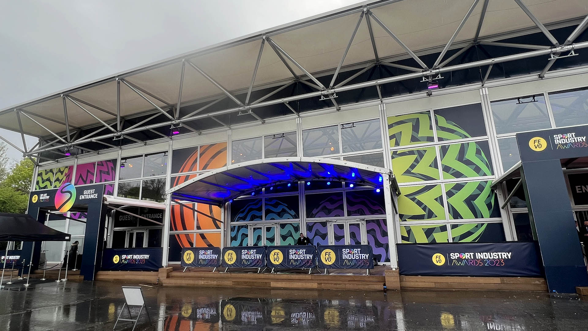
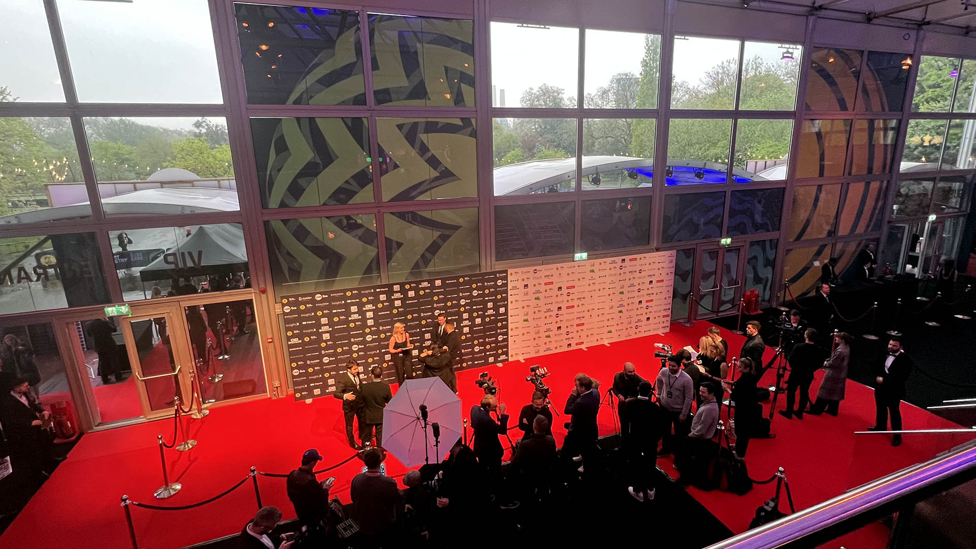
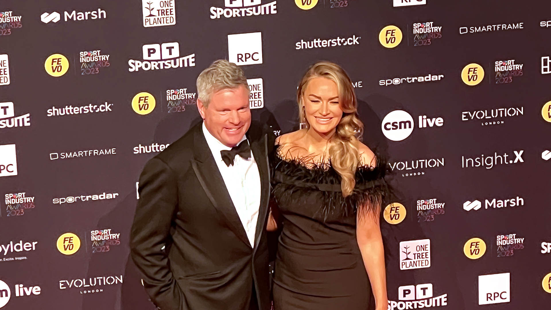
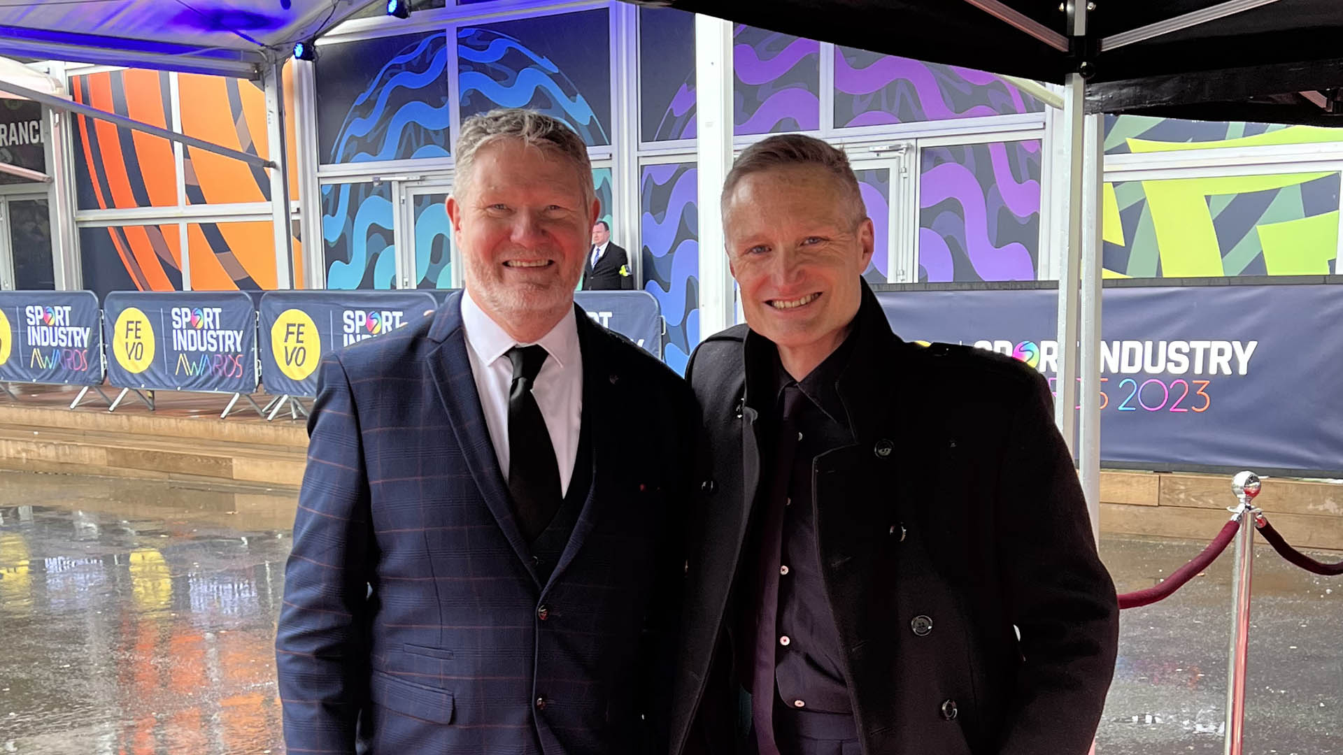
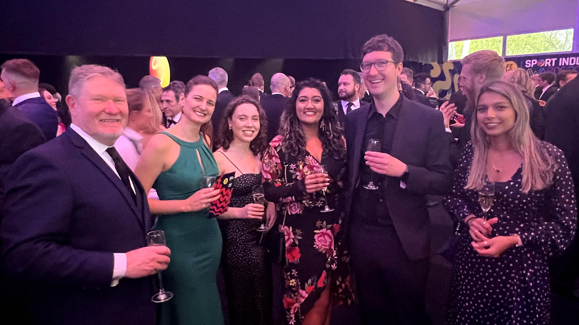
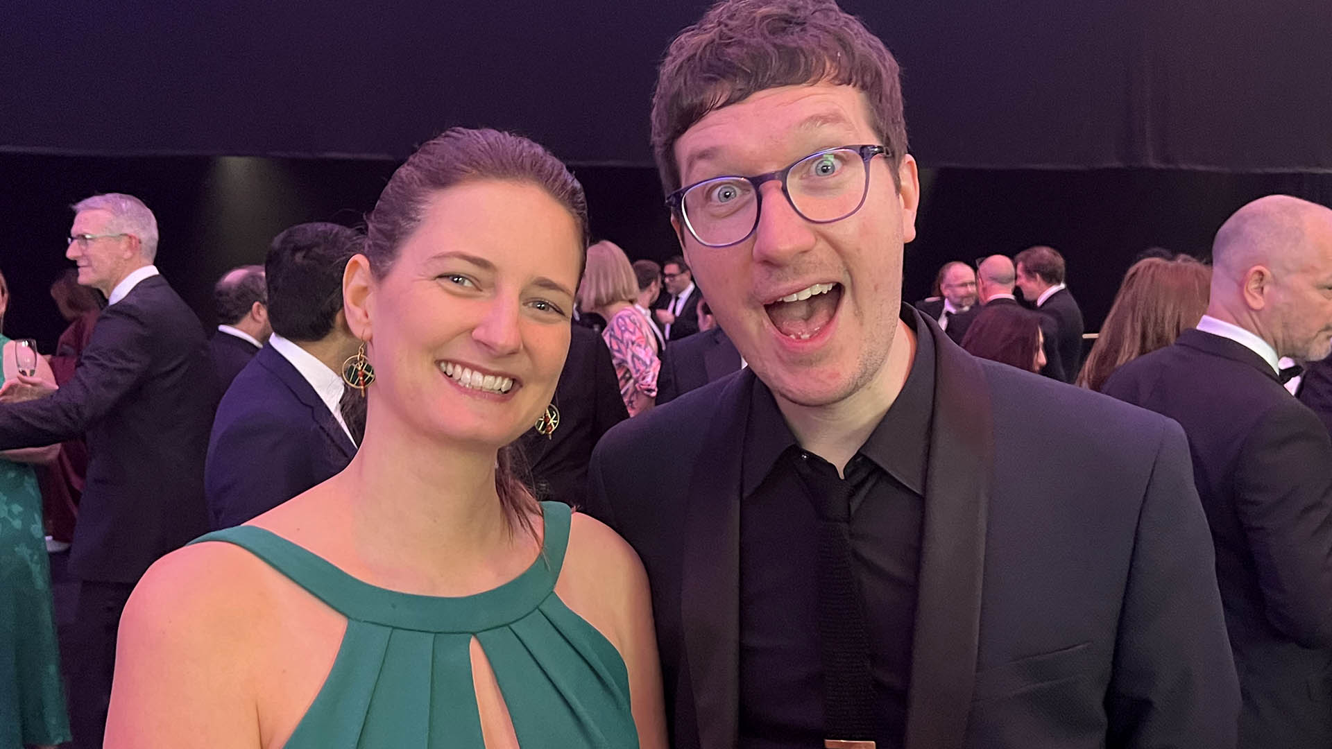
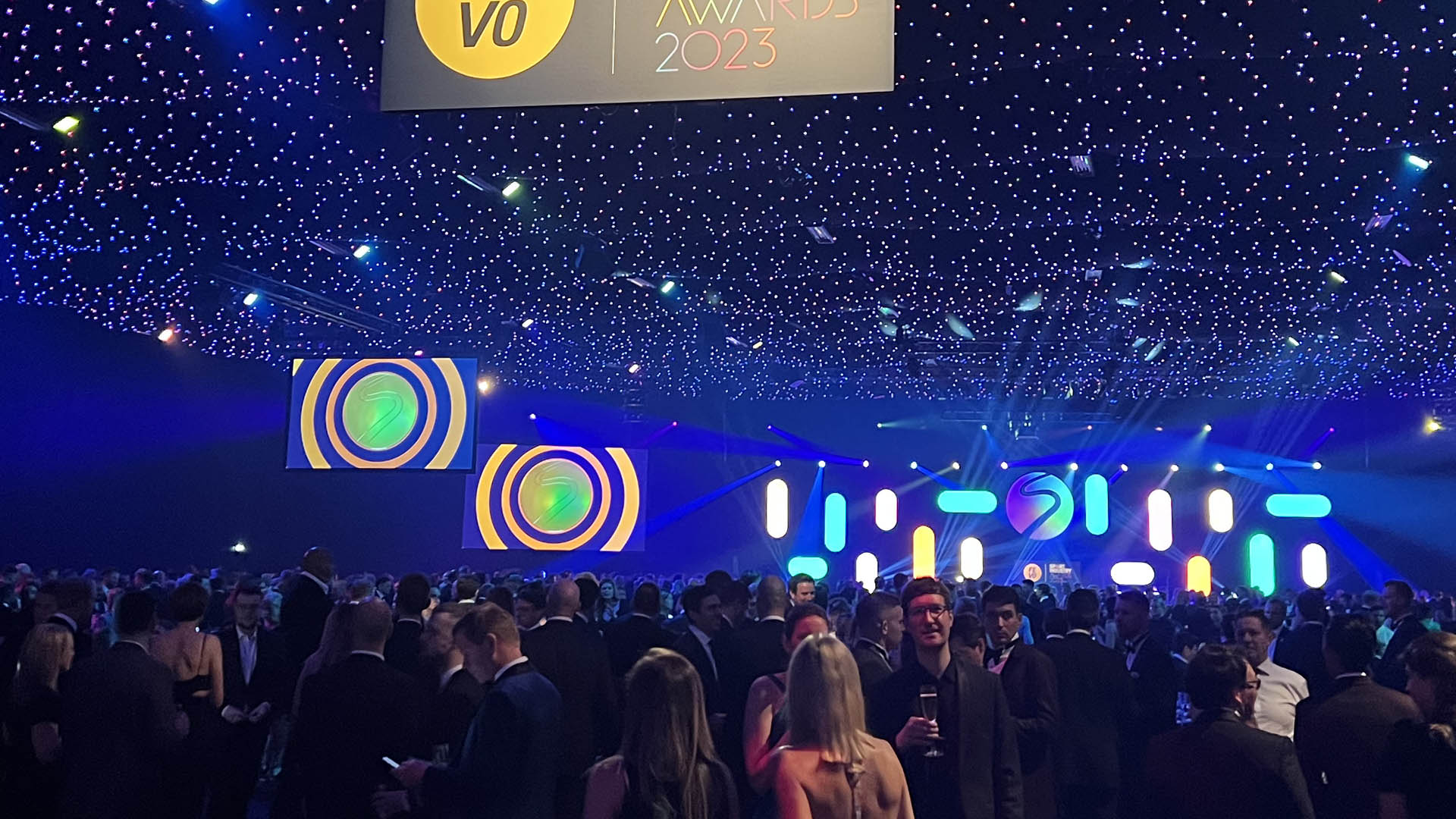
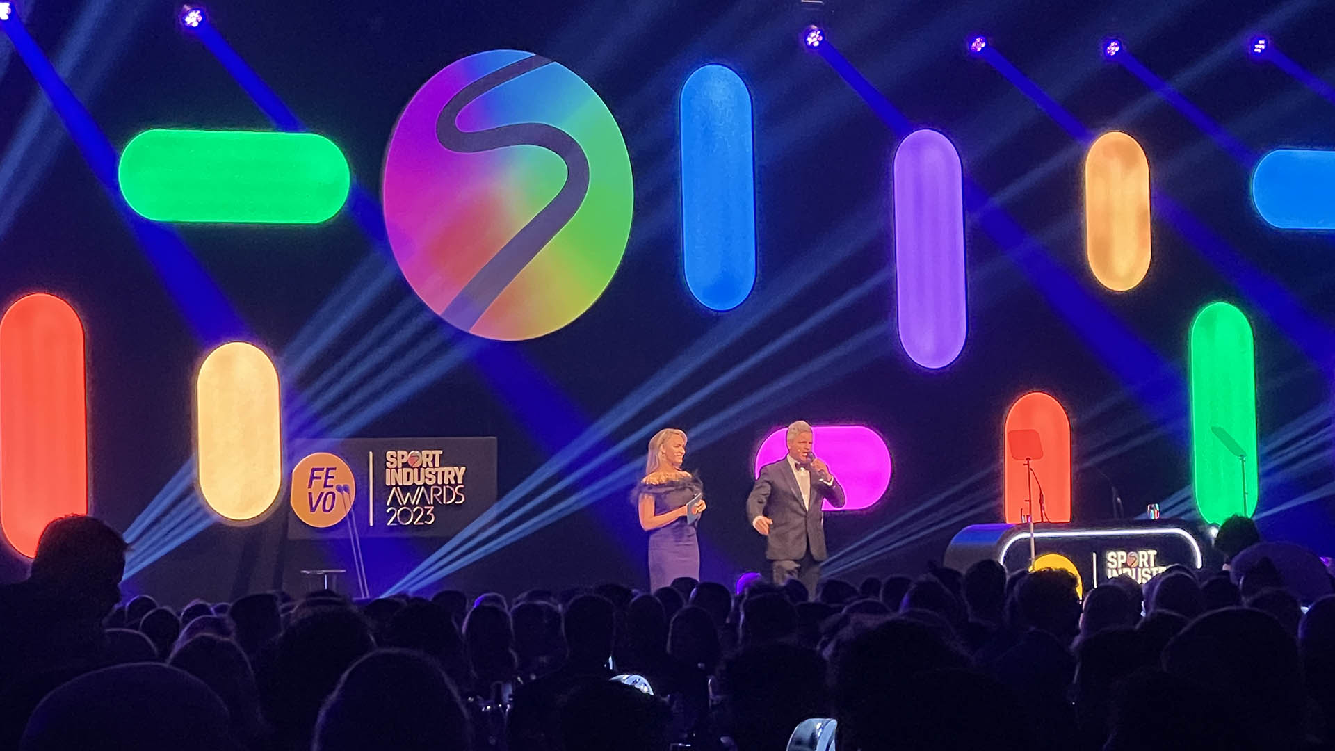
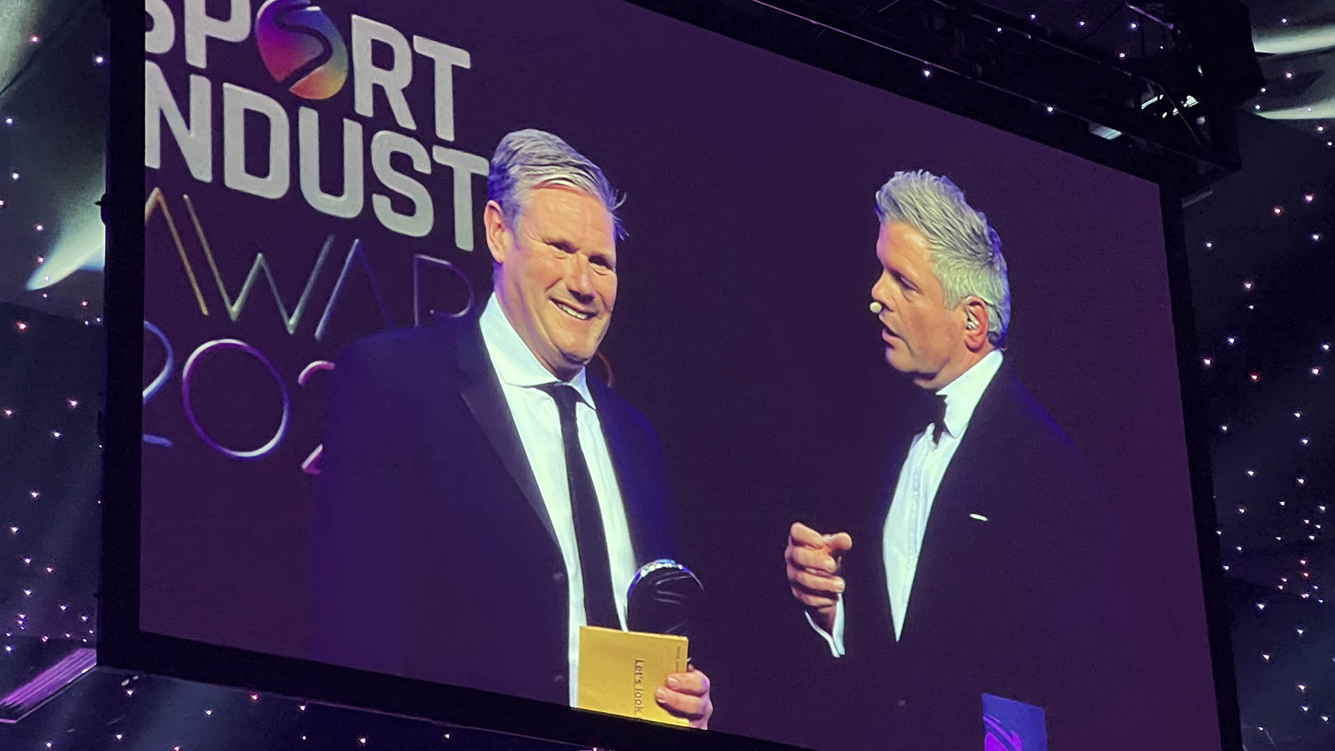
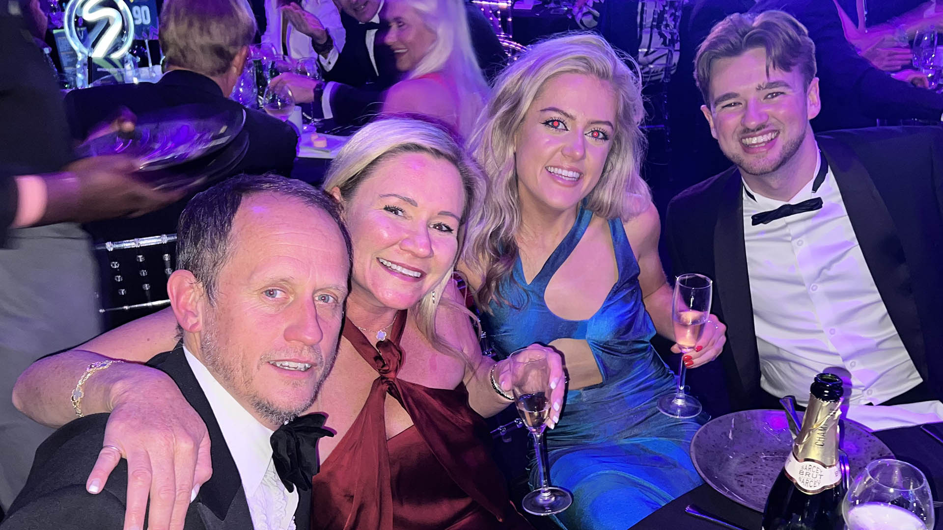
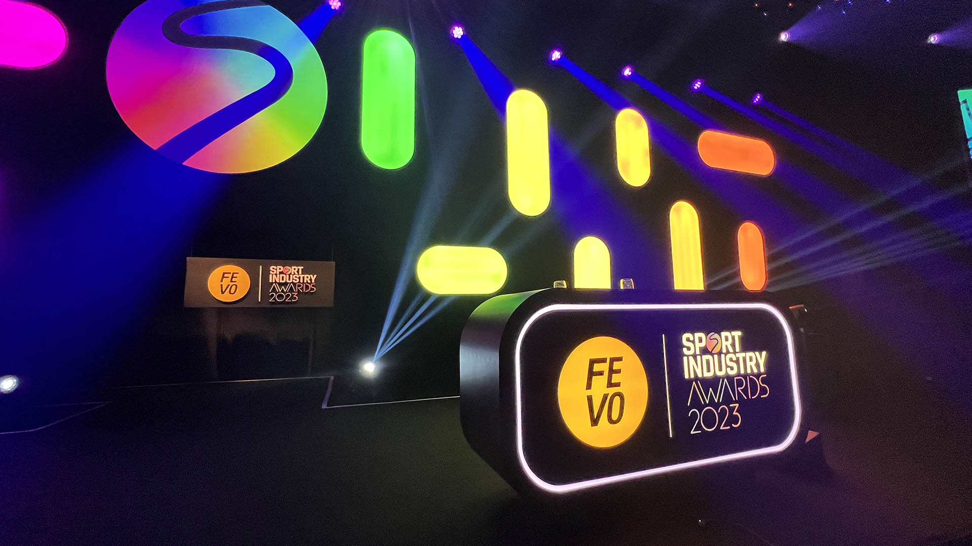
The FEVO Sport Industry Awards filled Battersea’s Evolution with over 1,500 of the industry’s top movers and shakers to celebrate and award the best of the best. Jump is the official graphics supplier for the evening – and it’s always a thrill to see the vast sparkling room pulsating with our animations.
Tom Love – Head of Content and Marketing at Sport Industry Group:
“We renew the creative for the Sport Industry Awards annually so when Jump presented three incredibly strong directions for 2023, it was a genuinely tough decision. That said, we’re incredibly happy with the route we went down and the end result, in my opinion, is the best-looking Sport Industry Awards ever.
The entire team is a pleasure to work with and their expertise makes delivering such an enormous event that much easier.”
Nick Keller – CEO Benchmark:
“Thank you Team Jump. You are the most outstanding partner. Your work elevated our brand and the Awards night. Your help incorporating our new headline partner was epic.”

This is the first year the event has been held with New York-based social commerce company FEVO as their new headline partner. Earlier this year Jump worked on graphics to announce this new relationship. Part of Jump’s brief for this year’s event was to integrate those new designs.
Callum O’Reilly – Senior Designer at Jump:
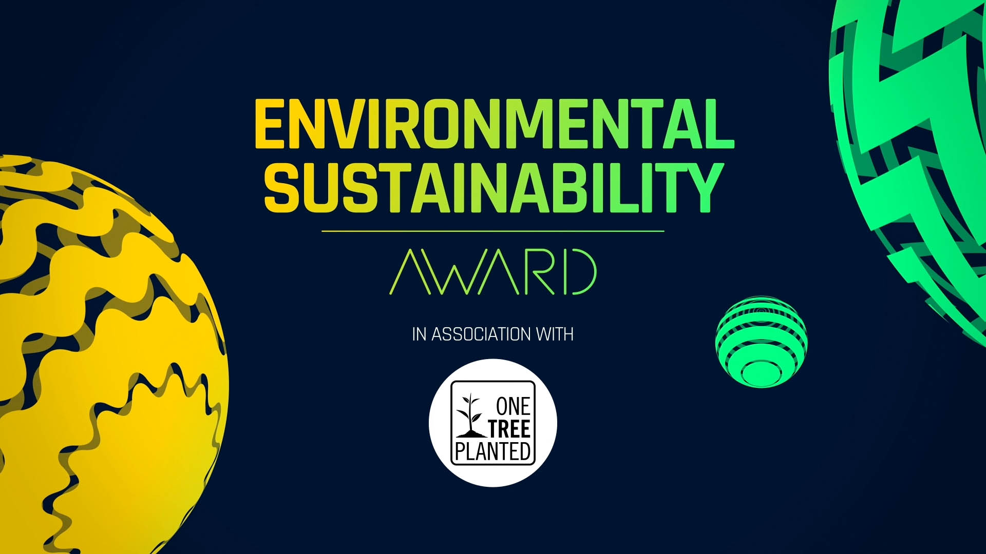
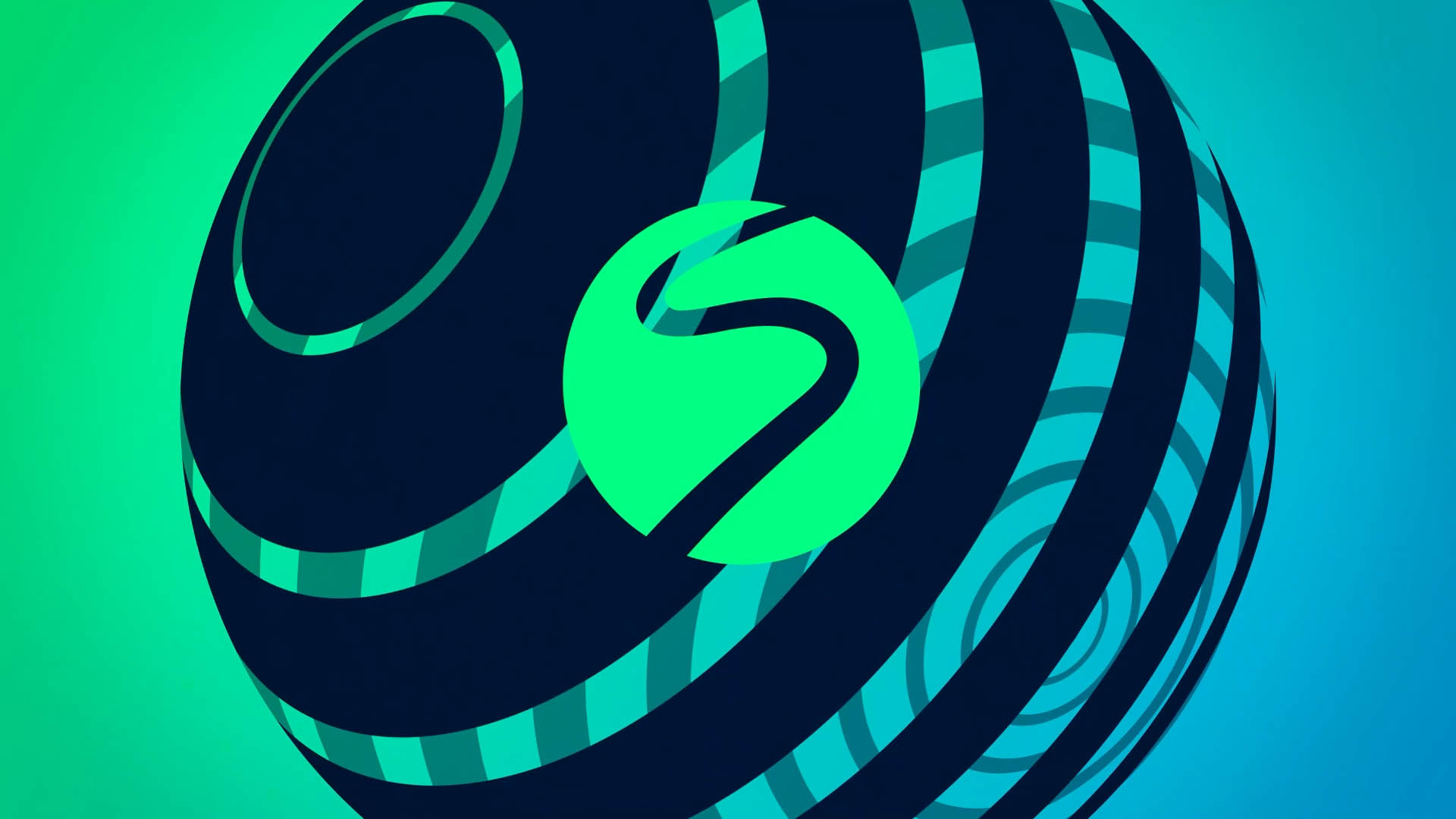
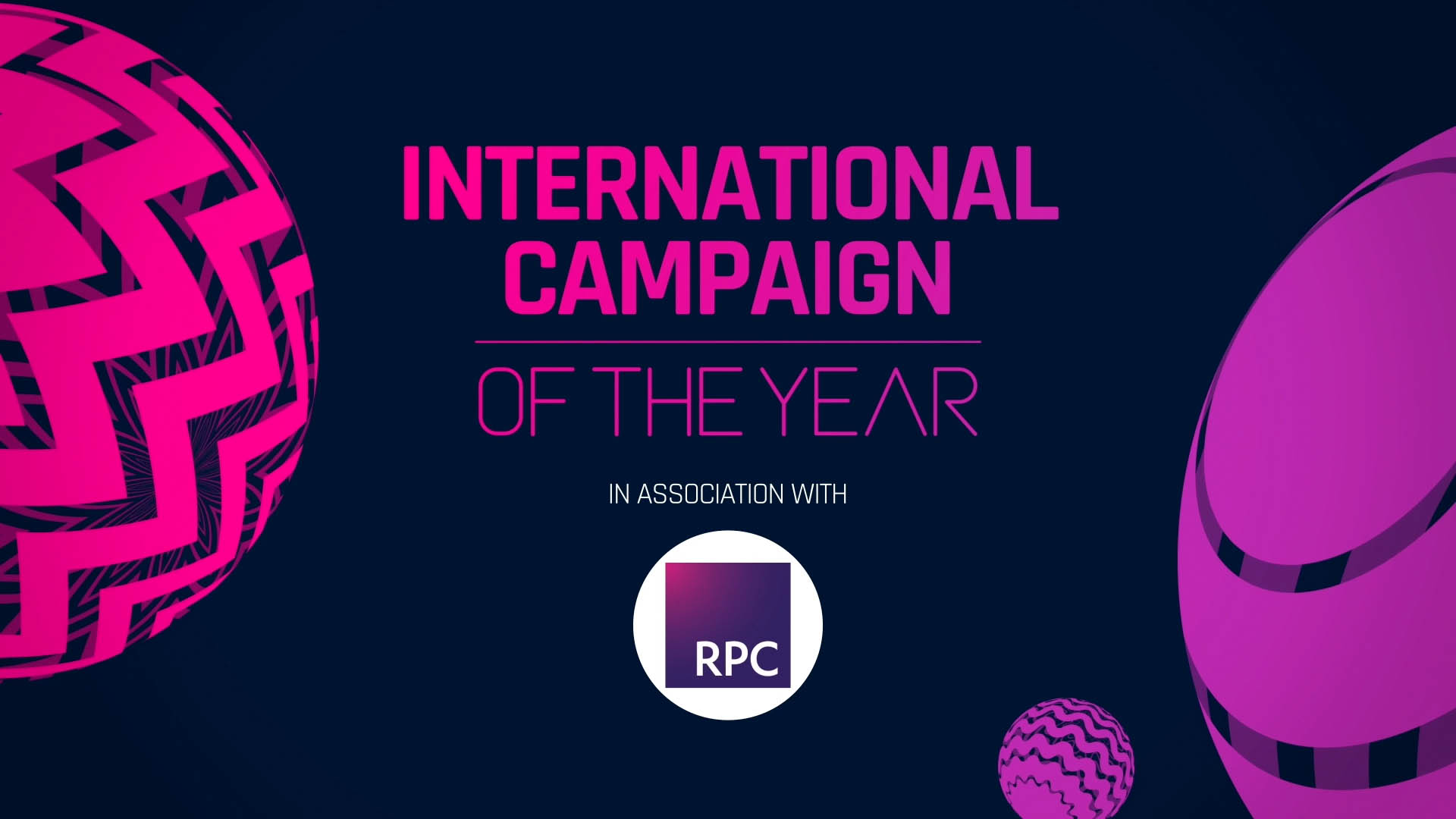
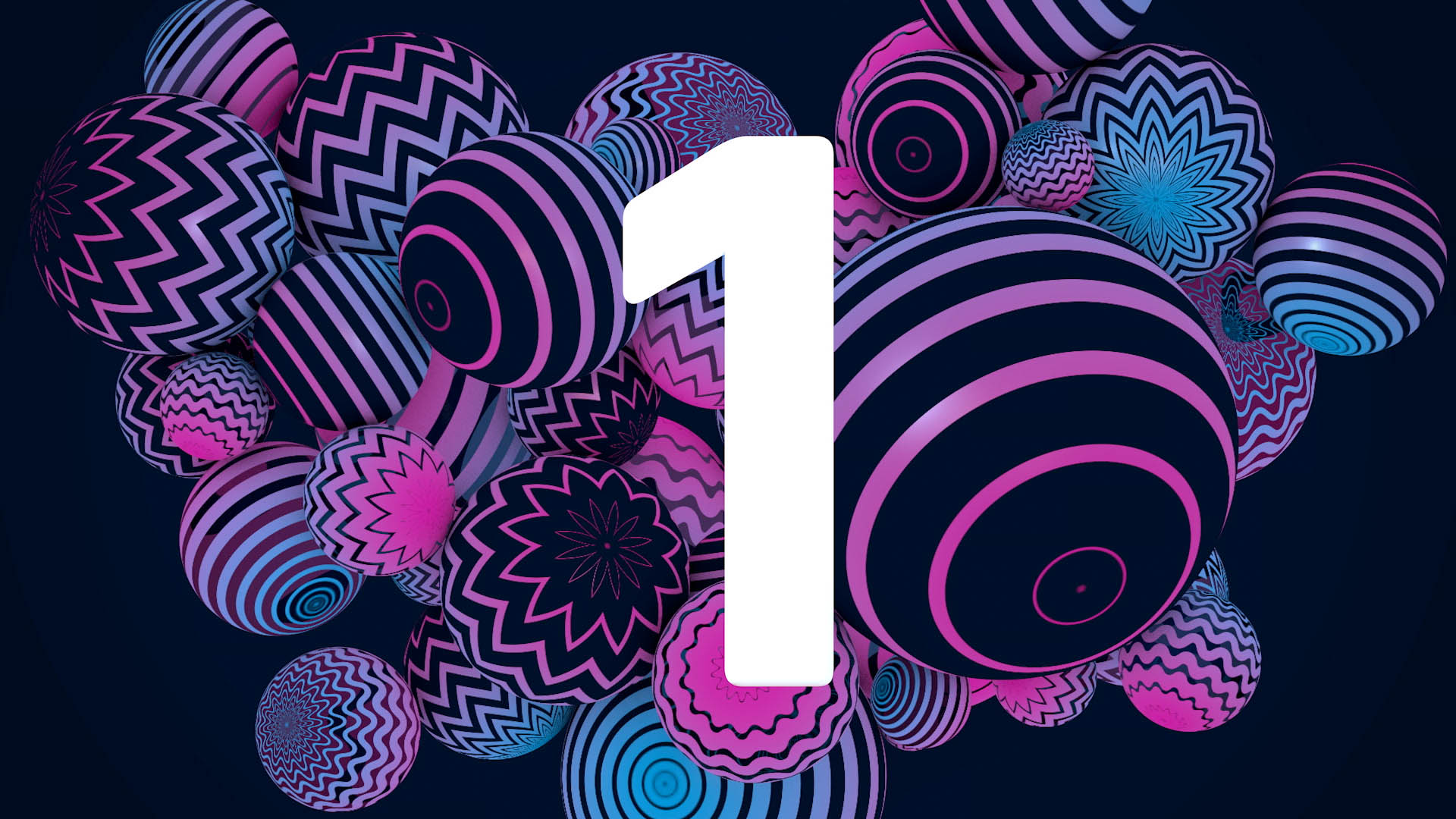
“This year’s FEVO Sport Industry Awards uses the patterned spheres that we created for the partnership launch animation as the main graphic element. As both FEVO and SIG have round logos we knew we could play with some fun transitions from one to the other.
We created a set of bright, colourful spheres which have animating patterns that were inspired by the 2021 creative. There are three types of animating sphere based on straight lines, wavy lives and jagged lines. All of these animations represent the energy of the awards night.
We’ve also utilised a lot more of the bright colour palette that we introduced for the 2020 Sport Industry Awards logo rebrand. This year’s graphics are the most colourful package yet!”

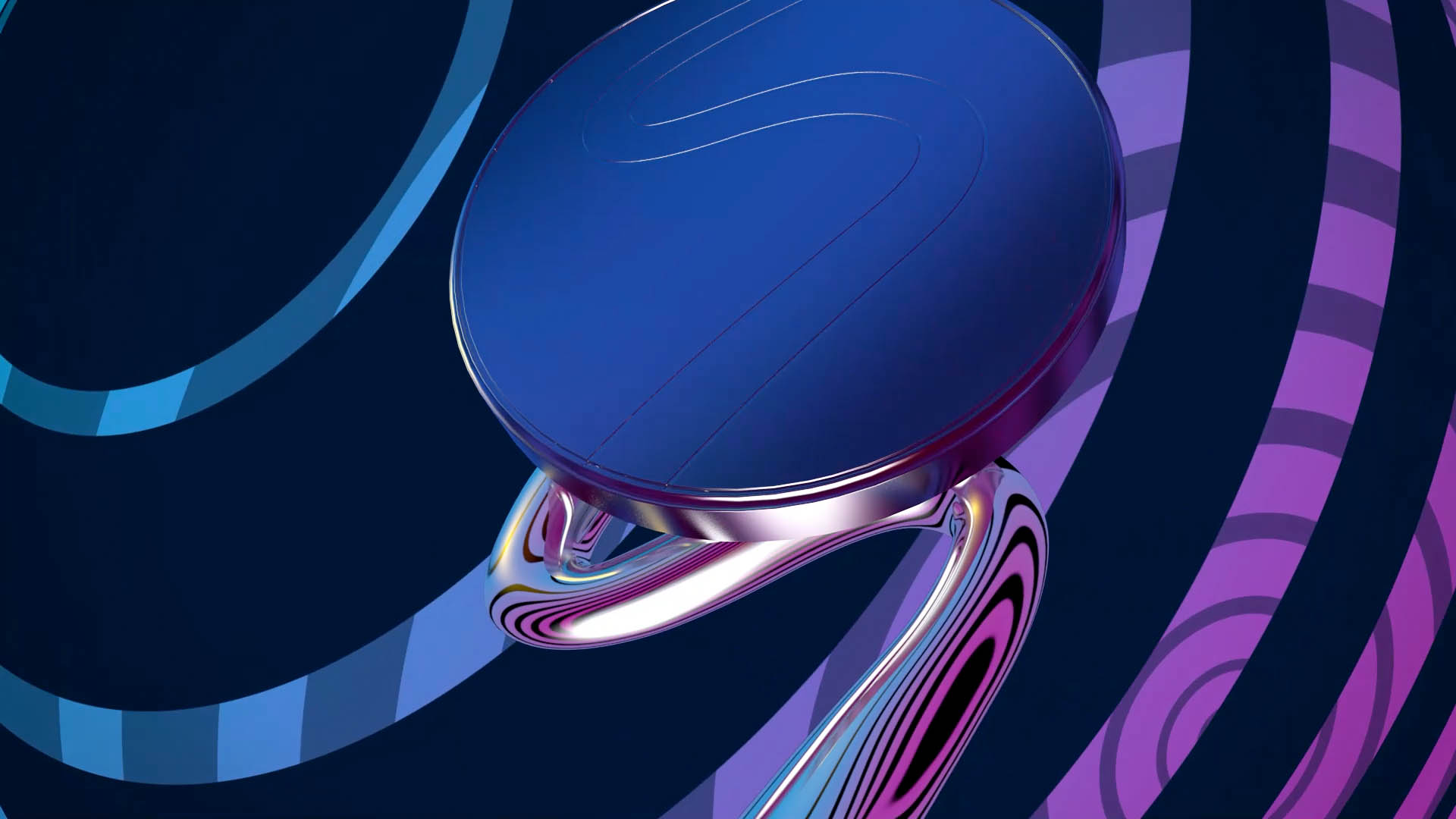
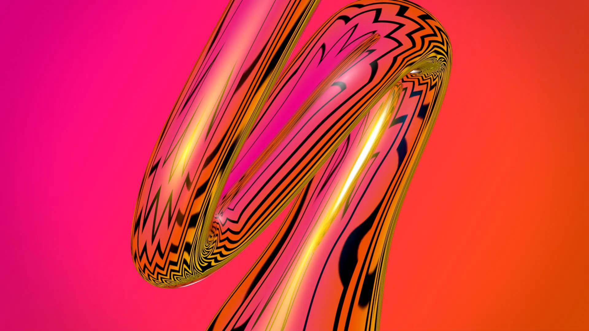
COR: “One of my favourite parts of all the new graphics are the 3D trophy renders. The new animating spheres are reflected in the surface making it look super vibrant and zingy. We made a more exciting trophy loop this year too as it is the most seen graphic on the night. We increased the reflection and twisted it in funky ways to make it really stand out.
We worked in Cinema 4D to create the scenes which feature the trophy and 3D spheres. After Effects was used to create the moving versions of the spheres and Illustrator for the initial stages when we were designing the look.”
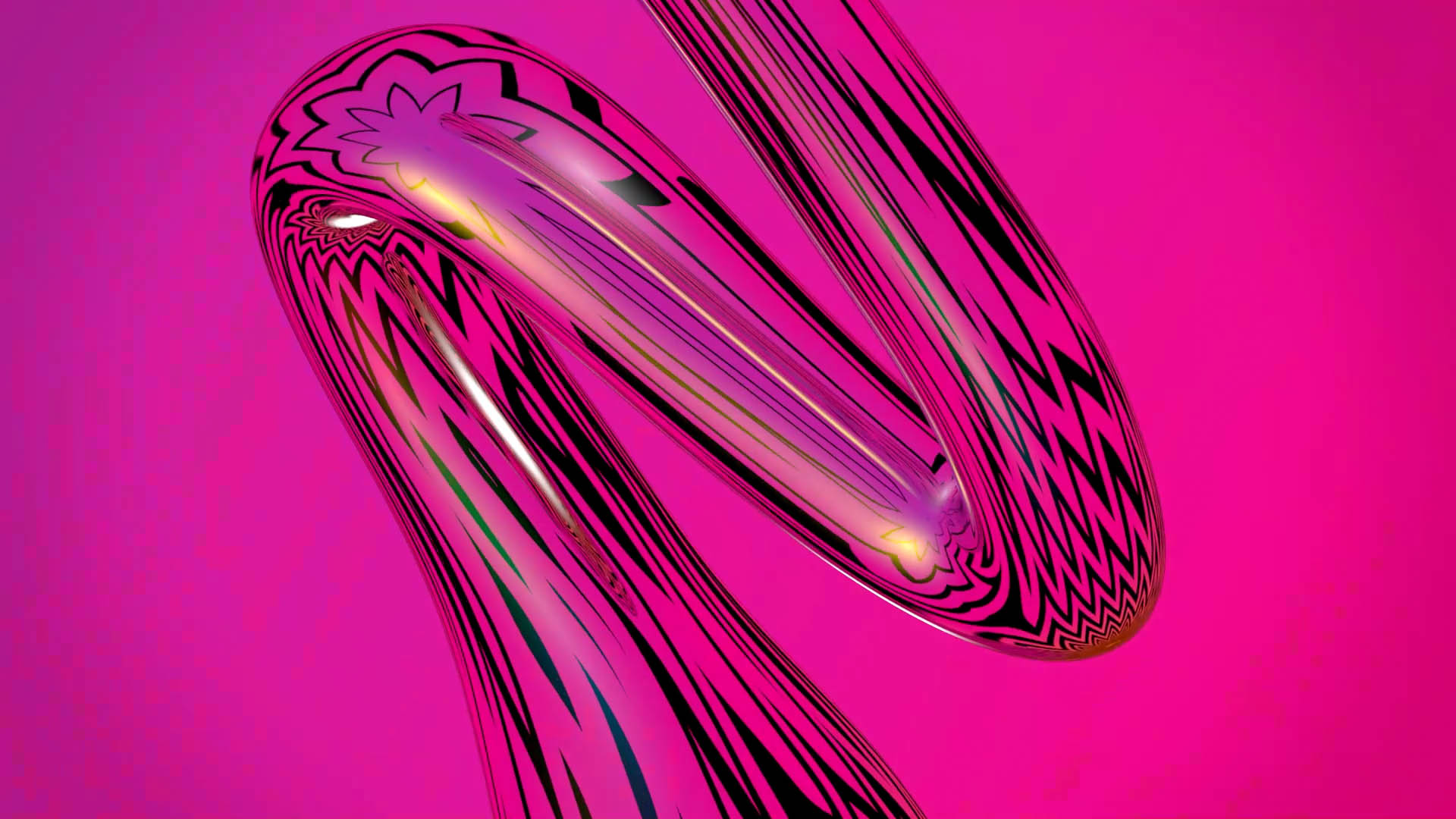
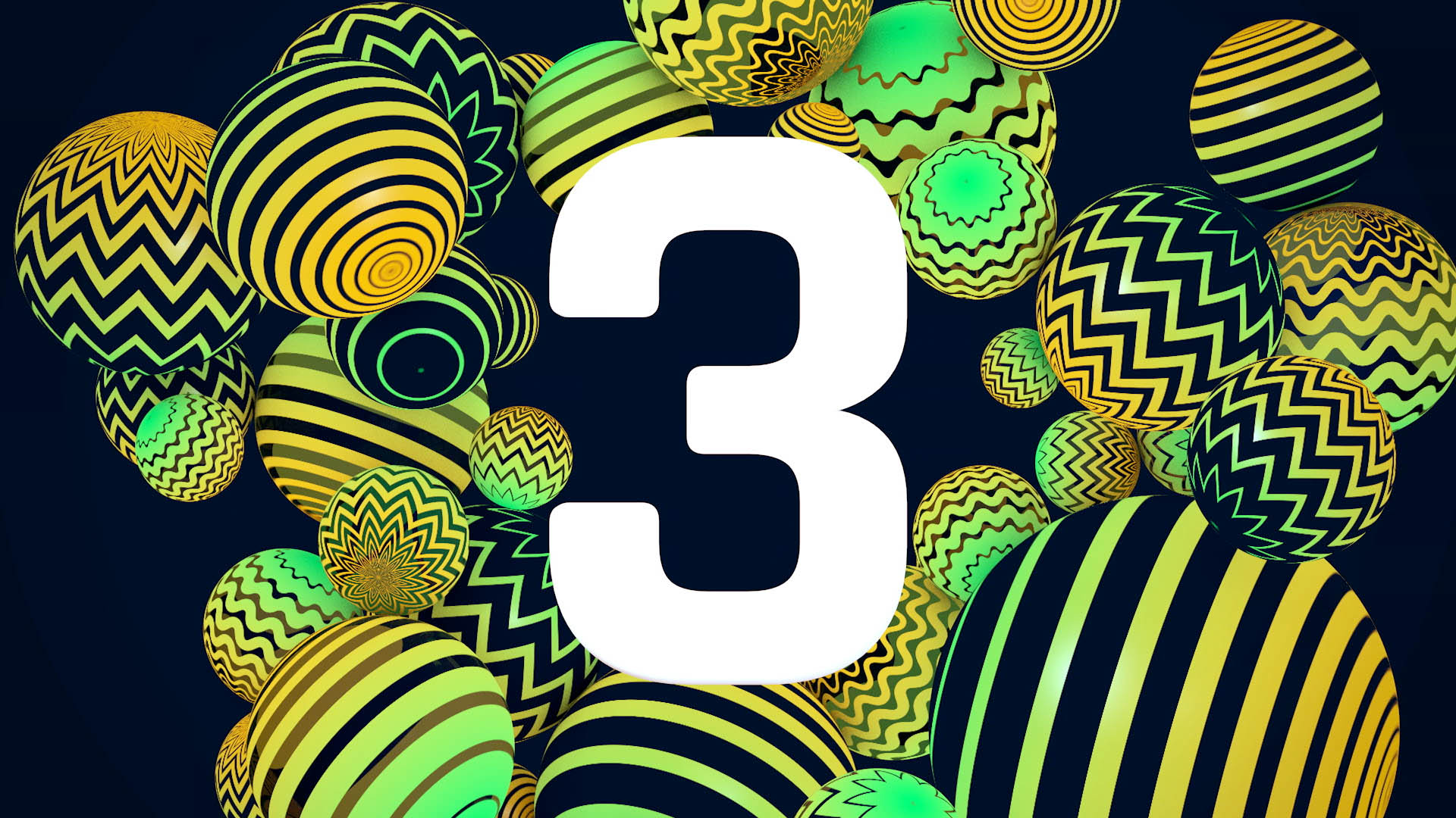
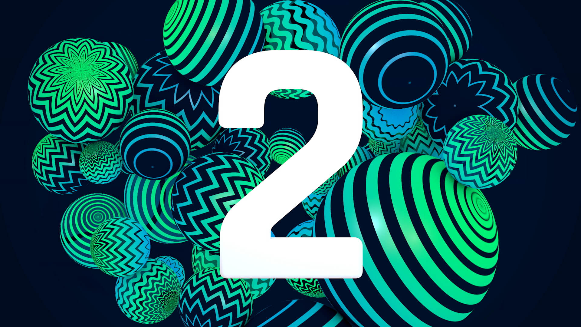
COR: “A new deliverable on our list this year was the countdown clock. We really made use of the spheres as tangible objects which explode with movement when each number slams in.
It’s super fun and playful.”
Becky Clacey – Designer at Jump:
“When we were creating the initial designs we kept in mind that we had to provide a kit of eye-catching animated assets. We had a set of vector spheres that were designed in Illustrator and we wanted to bring them to life. They were crying out to be looped so we could use them on all the derivatives. We started by creating a looping 2D animated matte in After Effects that could then be mapped around to create the sphere shape in Cinema 4D.
This was straight forward for the ‘straight-line’ sphere as the line goes from thick to thin, top to bottom. However we came across an issue when implementing the same process for the ‘zig-zag-line’ version. We soon realised it created a pinching effect at the top which we wanted to avoid. We added a solid section to alleviate this happening but had to take into account the zigzag shape to avoid any straight lines within the animation.
The most complex shape to animate was the ‘wavy-line’ sphere. The problem with this curved version is that the individual lines didn’t interlock neatly into each other. We had to change the shapes so there were gaps in between each of them.”
BC: “These looping assets have created a really vibrant and strong overall identity. Having each sphere in 3 formats, 7 colourways and at 8 different angles created a whopping set of 168 assets to choose from for each design. While one particular sphere was used on branding before the awards, on the night of the event they are all used in full force.
This brand has been really fun to work with. The use of a single asset creating so many different variations has been a designer’s dream.”
