

Client: Anchor Entertainment in partnership with Blumhouse Productions
Jump was commissioned to create the titles and programme graphics for True Crime Story: Look Into My Eyes.
This is the next release in SundanceTV’s popular ‘True Crime Story’ franchise. It premiered 15th June on SundanceTV, AMC+ and Sundance Now, with additional episodes premiering weekly.
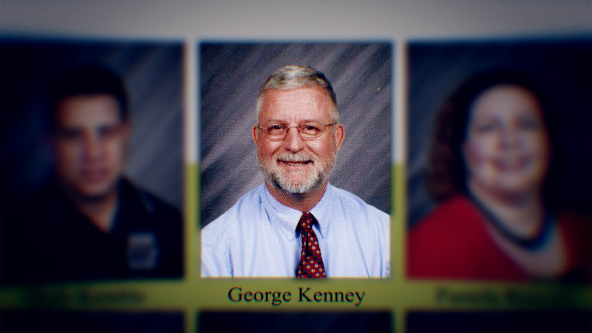
The four-part limited series from Ethan Goldman’s Anchor Entertainment and Blumhouse Television unfurls the bizarre story of Dr. George Kenney and his fall from grace after 10 years as a beloved principal at North Port High School in Florida where he practised hypnosis on students. In 2011, three teenage students died after a series of suspicious events. When a local media story questioned his involvement, the case exploded into global news. The series investigates events leading up to these untimely deaths and the tragic aftermath as victims’ families, eyewitnesses, experts, and people involved attempt to unpack what really happened.
Brent Hodge – Series Director:
“We had a kernel of an idea for an opening sequence. Something to do with highschool and pages flipping from the yearbook to enter that world, but that was really it for creative bullet points. What we got back from the initial idea phase to the final product from Jump was beyond anything I could imagine. A sinkhole visual into a yearbook that brings us deeper into a dreamlike journey of the film, every step giving a nod to extremely specific visuals we see throughout the series. The detail and accuracy was unlike any opening I’ve ever had on our films. The process with Jump was seamless to get this to execution.”
Our graphics for the series had to reference the positive work Kenney was doing but also the darker effects of the hypnotism.
Lee Jacobs – Senior Art Director at Jump:
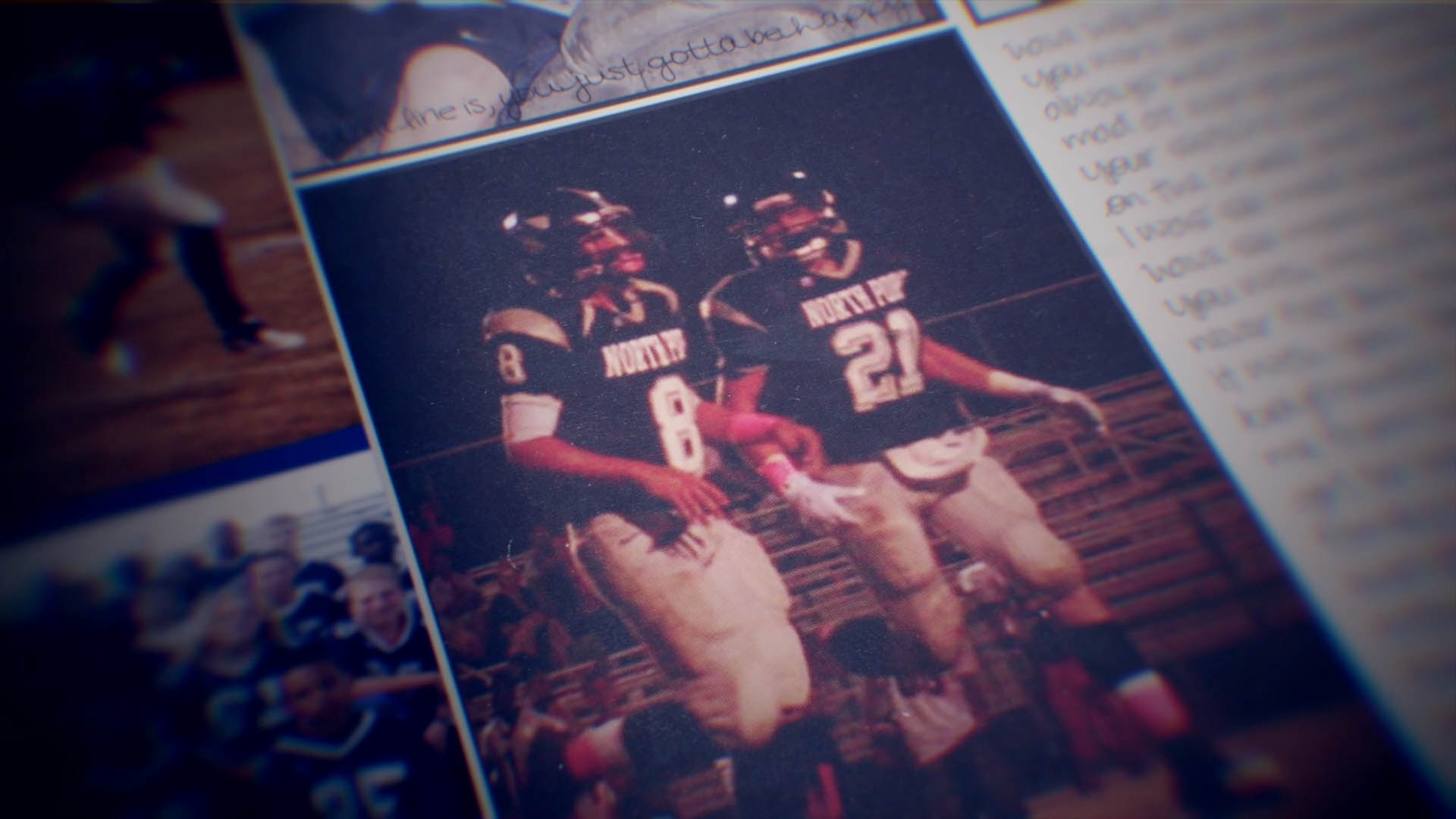
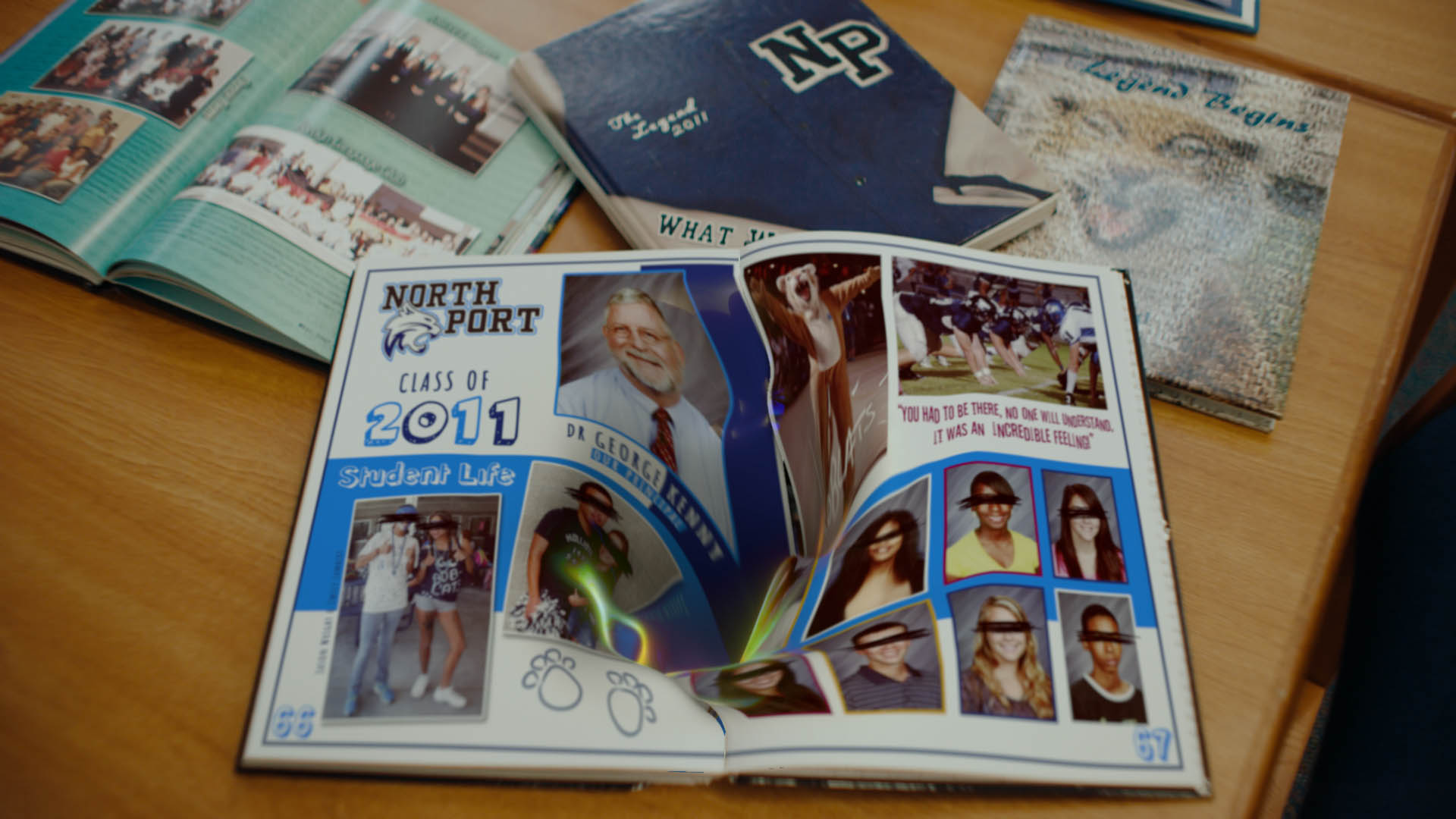
“We used one of the Series Director, Brent Hodge’s location shots as the gateway to the title sequence. He had filmed a number of school books on a desk. We replaced one with our own bespoke yearbook spread – which as we approach, melts away from us. We dive through the swirling pages, drawn into a hypnotic underbelly, as if exploring the darker realms of the school subconscious. The camera flips back to observe the classroom ceiling above as school portraits swirl past us.
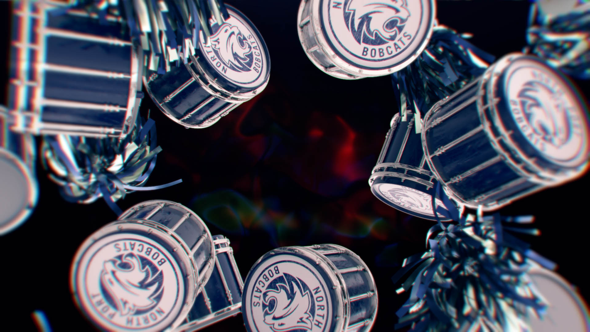
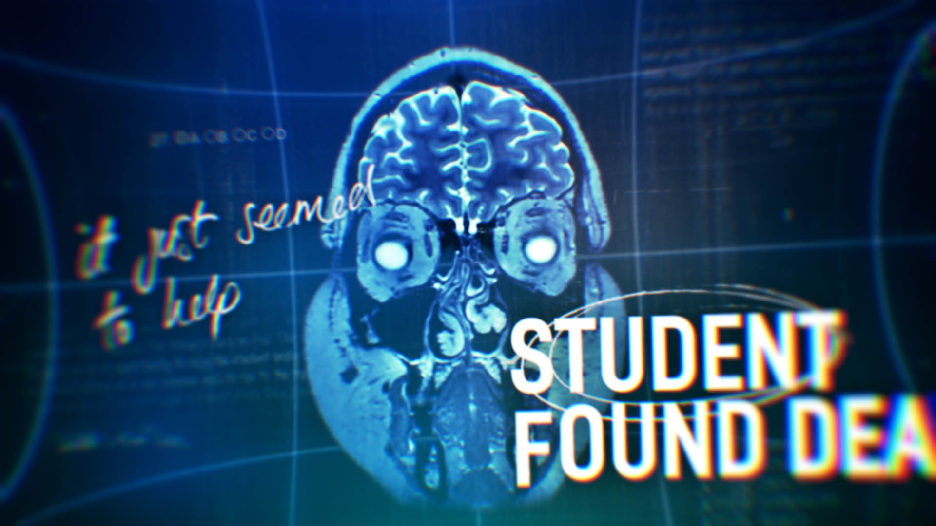
Marching drums and pom poms tumble past as we fall deeper. They morph into white roses which are a sad reminder of a teenager’s romantic gesture before he tragically took his life. We travel through a brain scan surrounded by test papers and newspaper headlines which report the tragic news of a student found dead. We emerge from the eye of Kenney himself to reveal the show title.
Throughout the sequence, the sound of Kenney’s voice guides us deeper into the world he has created. We find Kenney in a school corridor with his back to us. He has angel wings and daggers scrawled onto his back and is flanked by red balloons. This is a reference to the hypnotic script he was using on students and an icon which features towards the end of the series.”
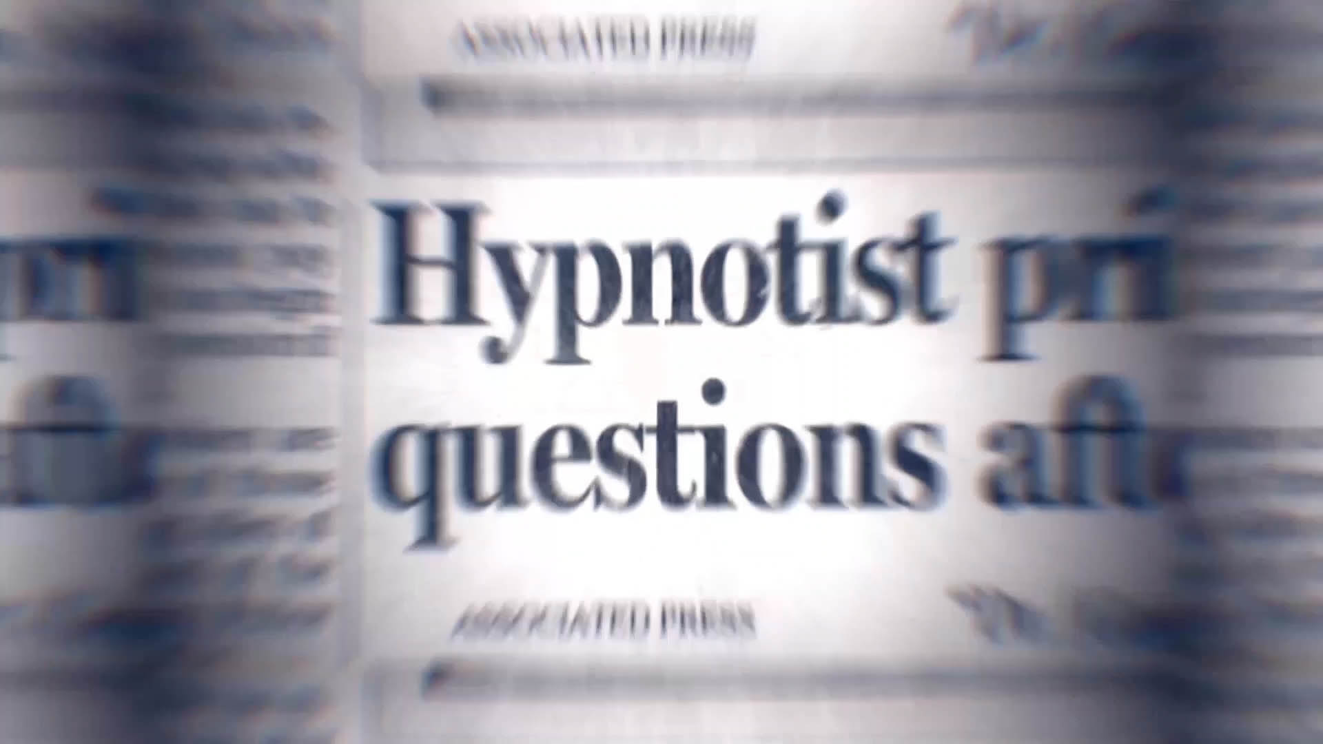
As well as the title sequence and logo design, Jump also created upwards of 100 archive treatments per episode. These involved adding colour, blurring and animation to a range of graphics including newspaper headlines to camcorder footage of the hypnosis sessions.
The titles were built in Cinema 4D, rendered in Redshift and composited in After Effects.
LJ: “Hodgee’s passion for his projects is truly inspiring. We shared lots of really fantastic creative calls early on in the project and had a huge amount of fun building Easter Eggs and references to the show’s themes into the hypnotic titles.”
